Like 45° minuto? Unfortunately, no
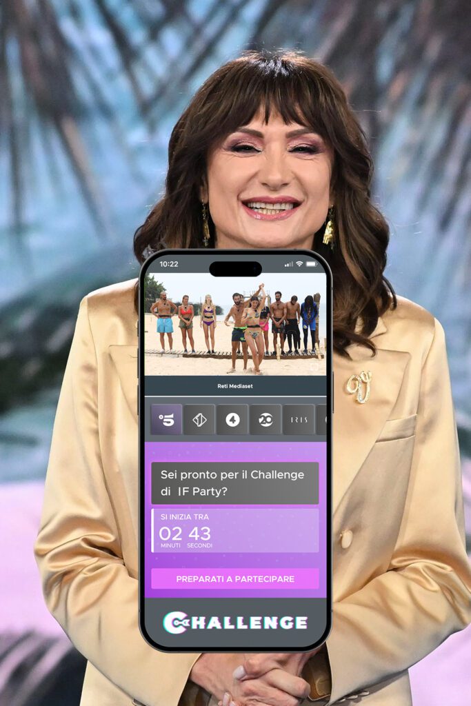
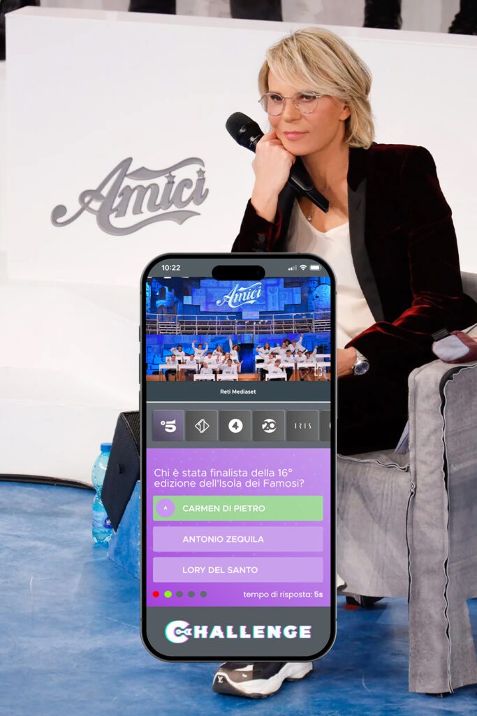
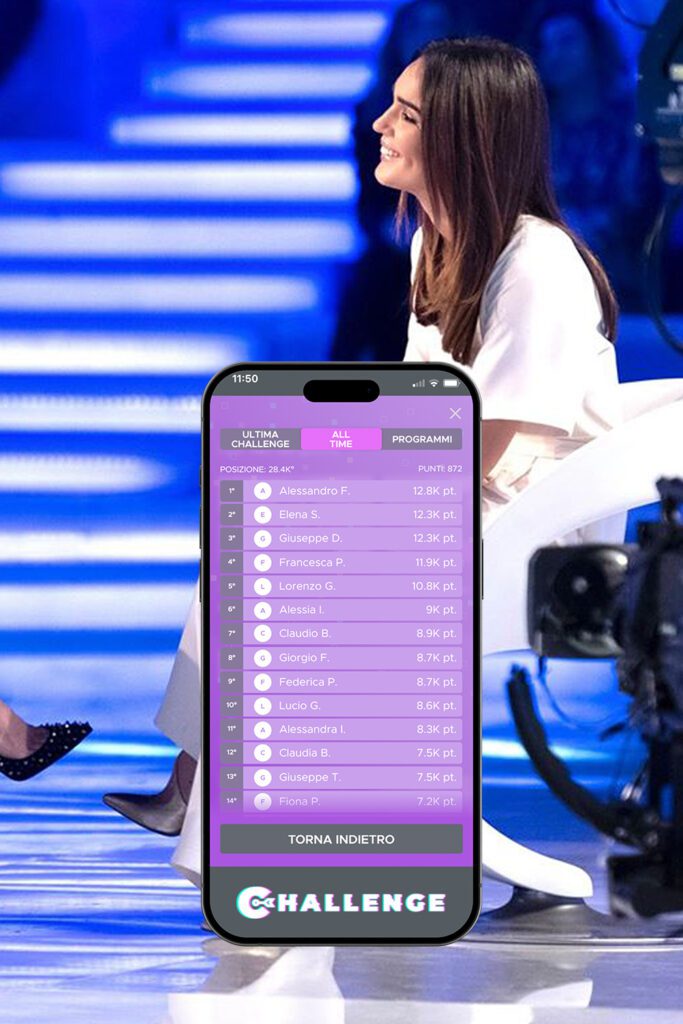
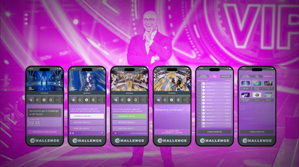
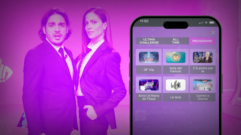
The quiz for Mediaset Infinity, in addition to having additional screens compared to 45° minuto, including special rewards and leaderboards, had an additional major challenge: streaming television programs.So, in addition to the usual quiz design, there was the complication and all the UI difficulties that come with having a video playing on top.
Furthermore, as if that wasn’t enough, the technical team at Mediaset wanted a quiz that could be flexible in the number of questions, but especially in the number of answers. So, from the back-office, they could choose the number of possible answers, whether it be 5, 4, or 3… Therefore, a UI for the answers was designed specifically for the situation, which had some very challenging worst-case scenarios in terms of pixels within which to fit a huge amount of information.
The secret of big brands
Not always is putting your own stylistic touch the best choice. Any design studio you enter will make you throw away everything you’ve done before because they do it better!
I’ll let you in on a secret: sometimes, that’s not the case. At FDA, if we ask you to change something about your brand, we’ll tell you why and explain in detail why what you already have isn’t working. Otherwise? We’ll stick to the style set by previous studios and still create something that works. In large brands especially, like Mediaset for example, studios that adhere strictly to brand guidelines and can technically deliver the work 100% in line with the brand image are highly valued.
